Pima Medical Institute Site Design
Introduction
Problem Statement
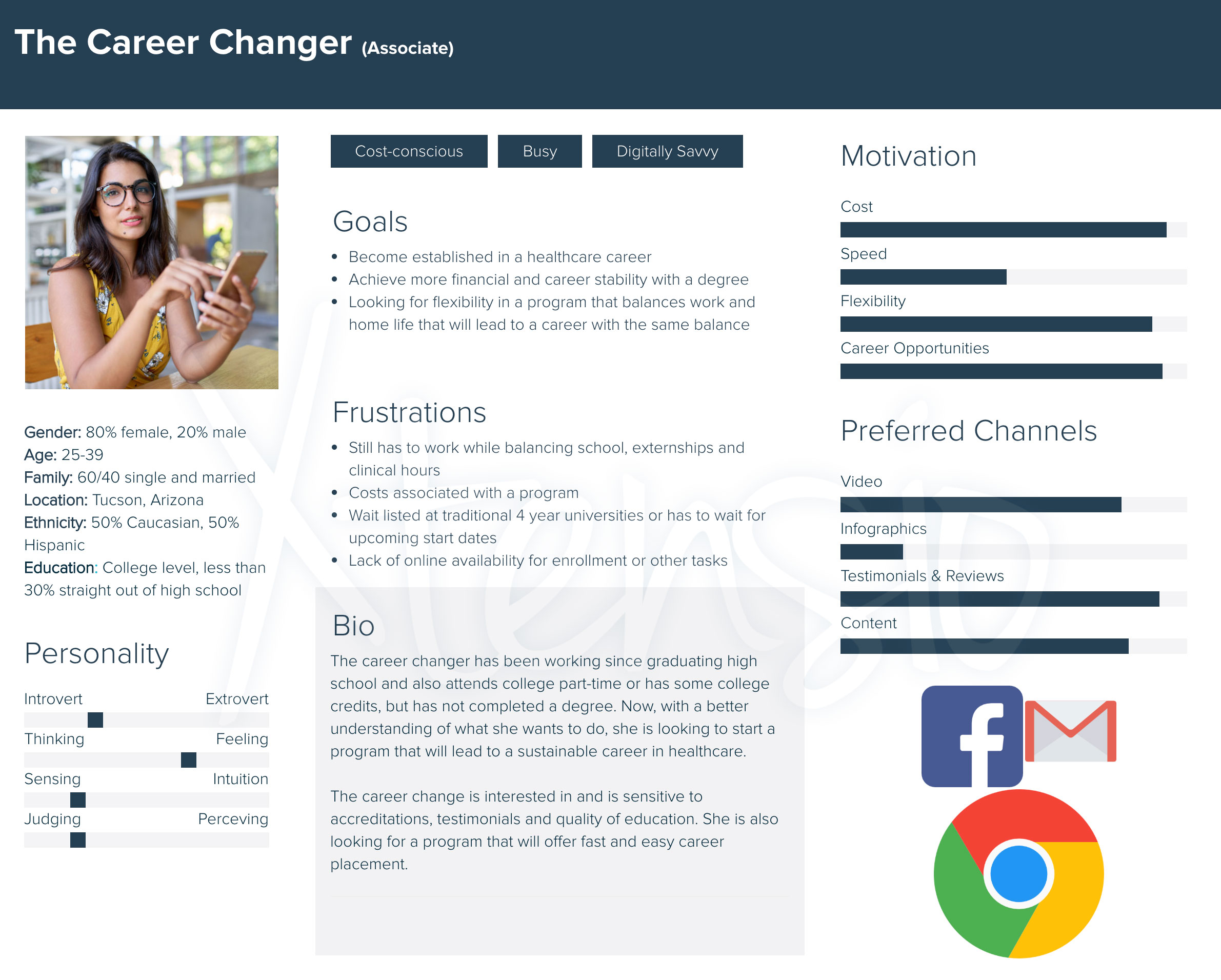
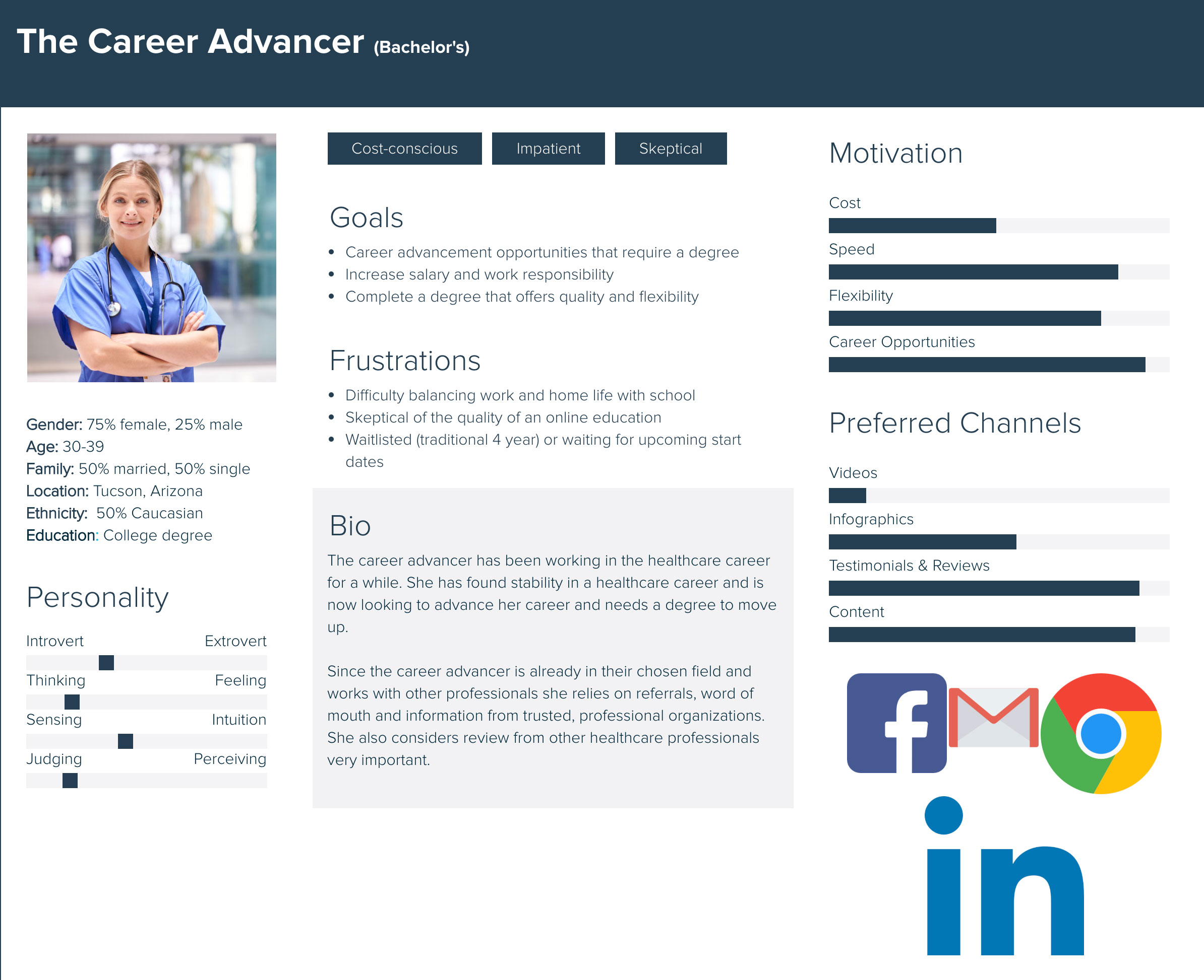
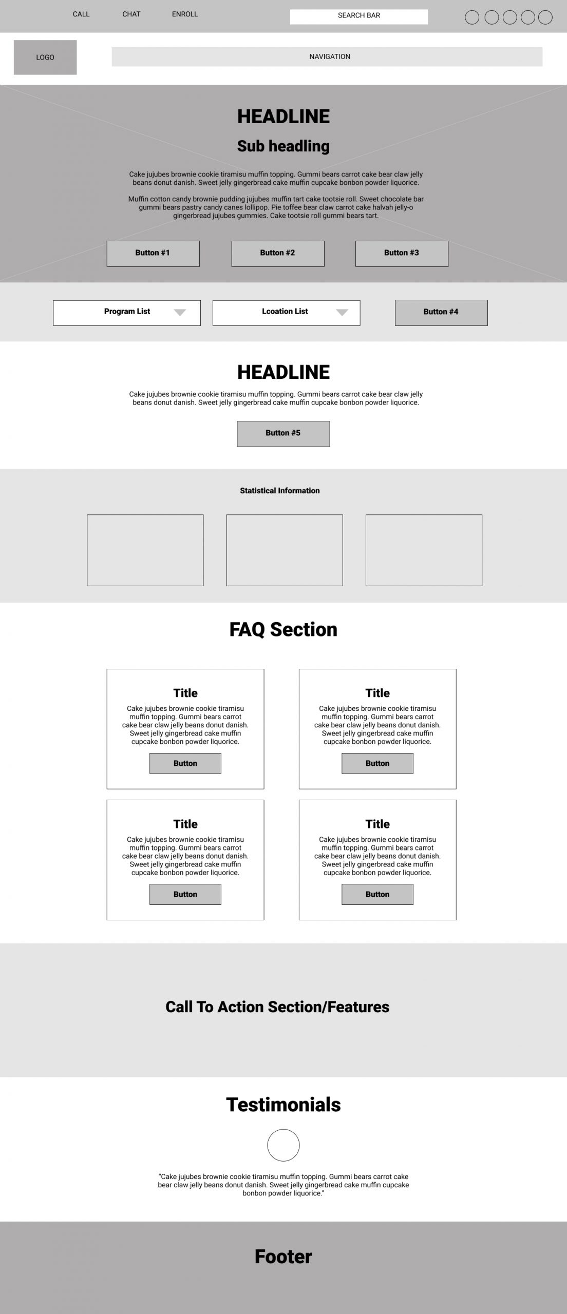
Pima Medical Institute’s desktop and mobile site has a poor interface making it difficult for the users to navigate. The users are unable to locate content they are looking for which is either due to the quality of content or usability of the interface. The average amount of time a prospective student is spending on pmi.edu is less than 1 minute with a bounce rate of 55.62% causing a decrease in lead flow and failure to fill out a form and eventually enroll.
hypothesis
A modern layout that displays the most requested information, that’s easy to find and digest will keep perspective students engaged long enough to complete a call to action.
objectives
- Design a user friendly home page that guides perspective students to the most requested information
- Provide content that is relevant to the prospective student, establishes trust and displays student life
- Reduce confusion amongst program page and learn more page by displaying clear content that address high priority concerns of perspective students


Usability Heuristics For Pima Medical Institute
User Control & Freedom
- Navigation needs to be updated to include hover and sub navigations for users to seamlessly move through additional options
- Users are required to click into the program page in order to see all programs. Once a user selects to ‘Learn More’ about a specific program the user is required to use the back button repeatedly or click back to the main program page. Versus having a drop down where the user can hover and see other program options
- Lacking a quick and easy exit
Consistency & Standards
- Contact information can be found in the upper right-hand corner
- All schools provide similar information including programs, schools, locations, admissions, financials, etc
- Pima Medical Institute also offers live chat for quick responses
- Online enrollment is not offered
Aesthetic & Minimalist Design
- PMI’s website is dark and unappealing
- The site is outdated and uses a very narrow layout compared to its competitors utilizing full width layouts
- Imagery is of actual students which empathizes with the user and to help them imagine themselves making a difference
- No video on the homepage to demo day in the life, hands-on or tours of campuses
- Videos are in their own section hidden in the sub navigation
- Mobile is mainly text and very little images; does not look like desktop site